|
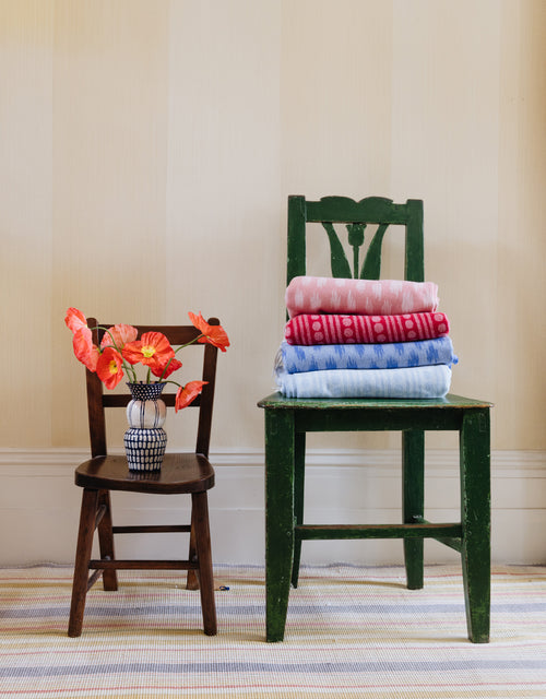
As lovers of bright and bold colours, we couldn’t be happier with Pantone’s choice of 'Living Coral' as 2019's Colour of the Year. Inspired by this vibrant tropical hue, we've done the colour testing for you and have created an essential guide on how to mix and match and use this cheerful colour effectively in your home. Blue The warmth of 'Living Coral' will create an elegant contrast with colder shades of blue providing a feeling of balance to the room. |

|
| Nahuala cushion, Rossmore rug and Tapa Kahala quilt |
|
Green No matter if you live in a city apartment or in a countryside home: mixing pink and green hues will instantly achieve a subtle tropical look at home. |
 |
| Oakleaves cushion, Floral inlay tray and Mali Star quilt |
|
Red If you are afraid of strong contrasts, red is a perfect colour to combine with 'Living Coral', an ideal match to create a warm and inviting space. |

|

