|
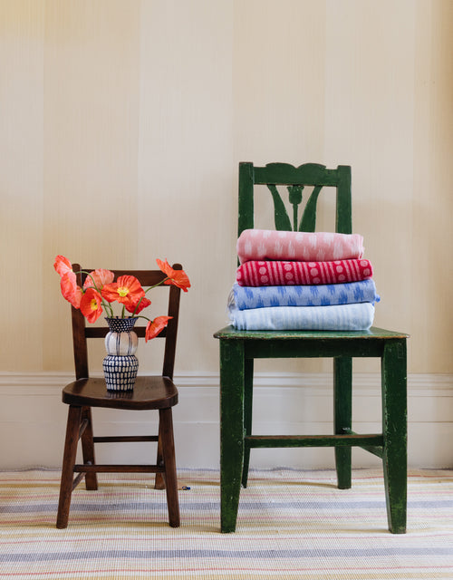
This week we’re back with Edition II of our Colour Guide, created in collaboration with Edward Bulmer Natural Paint. For this guide we are exploring ‘How to Pair Colour with Pattern & Print’ and have packed it full of hints and tips on how to master mixing and matching in your home. From building schemes around your favourite designs, being brave and bold and using classic colours and prints as a launch pad. Download the PDF here to revert back to and if you missed Edition I - Five Cult Colour & How to Style Them – you can catch up on your reading and download it here. Colour and pattern are the building blocks of every interior - the palette and motifs you use in a space will not only define the aesthetic, but affect the light, set the mood and ultimately create the character of your home. But where to start? We've rounded up our five top tips with Edward Bulmer Natural Paint to get you mixing colour and pro... |
|
|
|
1 Build around a favourite pattern If you’re feeling overwhelmed by designing a whole interior scheme, we say start small. Pick a pattern you love - it’s a great way to build a scheme. Try not to overthink it - often something which catches your eye is the perfect launchpad. From the pattern, you can pick colours which draw out elements within the motif, in turn putting the pattern more in focus. Our favourite pattern pick: CABALLO Pair it with: Azurite, Lilac Pink, Sang de Boeuf |
 |
|
Remember, for a balanced space, sometimes the best colours to draw out are not the main shades - with our Caballo print, we’d choose accents tones to create a well-rounded scheme - Azurite from the rider’s blue, Lilac Pink from the subtle stripe, or Sang de Boeuf to highlight the earthy tones in the pattern, adding depth. |
|
|
|
2 Be bold - combine strong motifs with strong colour Be daring to create an animated space (and try not to worry too much about coordinating colours). With this approach, the key is to let your inner maximalist take over. Brave layering of deep colours and vibrant prints really makes a space. This works particularly well in rooms with less natural light, transforming a gloomy room into something truly special. Our favourite strong motif: STAR Pair it with: Patent Yellow, Pea Green, Tyrian |
 |
|
The key here is to avoid anything too ‘matchy’ - starting with the star’s vivid palette, select other bold shades that will complement the colours in the motifs. The balance of colour within the space is also important - we recommend selecting a main colour, layering other shades as accents. |
|
|
|
3 Start with a colour If you don’t know where to start when it comes to choosing prints or patterns, flip the plan on it’s head and start with a favourite colour (see edition 1 for the cult colours we love right now). Find your dream tone or shade by scan colour cards, flicking through magazines or browsing Pinterest. With colour in the bag, your choice of patterns is instantly narrowed.
Our colourful pick: PALOPO Pair it with: Lute, Verdigris, Pompadour |
|
A deep red like Pompadour or soft neutral like Lute are both timeless colour choices - Palopo’s mustard and burgundy accents make it the perfect pattern partner. Accent colours can then be drawn from the motif - Verdigris highlights one of the stripes - or chosen to coordinate with the other colours in your scheme. |
|
|
|
4 Soften bold pattern with neutral colour Neutrals work as an excellent canvas to let bolder patterns shine, without feeling overwhelming. Pairing vibrant motifs with these gentler colours is the perfect way to balance a space, creating a sophisticated mood. This will work particularly well for serene spaces - bedrooms or sitting rooms - as well as larger rooms and more traditional surroundings. Our bold pattern pick: TAMAHU Pair it with: Buff, Sea Green, Vert de Mer |
|
A warm neutral - try Buff - and vibrant pattern - we love Tamahu - are the perfect duo to start a scheme. The key is to layer in more pigmented shades - we’ve selected Sea Green and Vert de Mer to balance the warm earthiness in Tamahu’s palette. |
|
|
|
5 Combine classics If in doubt? Keep it classic. There’s a reason certain motifs - think stripes, ikats, florals - never go out of style. Versatile and timeless, these patterns defy fleeting trends and will last long beyond next season. In a scheme, we like them best paired with perennial colour - for an interior scheme that will never lose its appeal. Our classic favourite: ANTIGUA Pair it with: Quaker, Turquoise, Red Ochre |
|
The beauty of a classic blue red and white stripe like Antigua is that it can be paired with almost any colour combination. Soften it with Quaker’s earthy softness, coordinate it with Red Ochre’s rich depth, or create a subtle clash with vibrant Turquoise. |


